Color is not merely seen — it is felt. It hums beneath the surface of our lives, shaping perception, stirring memory, and defining mood. In interior design, color becomes language. And when plants enter that language — vivid, green, and alive — they become both punctuation and poetry.
To combine plant styling with intentional color palettes is to move beyond decoration and into design storytelling. The textures of leaves, the shades of stems, the soft riot of florals — all offer opportunities to harmonize or disrupt, to calm or awaken. Whether your interior leans toward quiet minimalism or vivid eclecticism, plants can translate your palette into something felt with both the eyes and the breath.
This article explores the art of integrating plant life into cohesive color narratives — teaching you to blend, balance, and elevate your interior space with intention and grace.
Understanding Green as a Neutral
The first principle of combining plants with color is to recognize that green, in its many shades, is surprisingly neutral. It pairs effortlessly with a wide spectrum of palettes, acting as a bridge between bold tones and soft hues.
Deep forest greens add grounding and weight. Pale eucalyptus offers a silvery coolness. Bright spring greens bring clarity and vibrancy. When selecting plants, observe their foliage as you would any other design element — considering tone, intensity, and variation.
In monochromatic interiors, plants offer necessary contrast. In multicolored rooms, they bring cohesion. And in minimalist designs, greenery adds softness without clutter.
Matching Plants to Color Schemes
Let your room’s existing palette guide your plant choices. Here’s how greenery can be used to support, contrast, or enhance common interior tones:
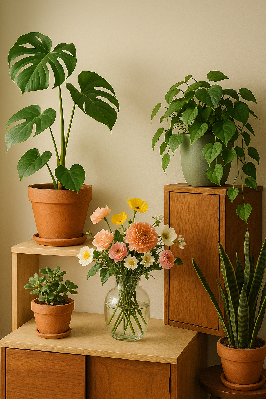
1. Earthy and Warm Palettes (Terracotta, Rust, Ochre, Olive)
These palettes welcome rich, textured greenery. Choose:
- Rubber plants (deep green, glossy leaves)
- ZZ plants (almost black-green, architectural)
- Philodendron varieties (dense and sculptural)
- Warm-toned pots in clay, copper, or matte bronze
Layering deep greens into warm interiors enhances a feeling of comfort and natural richness.
2. Cool and Minimal Palettes (Gray, White, Slate, Blue)
Cool palettes thrive on soft greens and subtle contrast. Opt for:
- Silver Pothos or Eucalyptus (with dusty, blue-green tones)
- Ferns or air plants (delicate and textural)
- Simple glass vases or white ceramic planters
Here, plants should act as breath, not exclamation — adding movement and life without visual noise.
3. Bold and Eclectic Palettes (Jewel tones, Citrus, Patterned Walls)
When interiors are expressive, plants become co-conspirators. Try:
- Monstera Deliciosa (large, tropical, graphic)
- Calatheas or Maranta (colorful patterned leaves)
- Anthurium or Croton (plants with variegated or unexpected hues)
Use brightly colored planters, unexpected placements (hanging, wall-mounted), and even mix florals into the greenery to echo the room’s creative spirit.
4. Soft and Pastel Palettes (Blush, Mint, Cream, Pale Blue)
Pastel spaces respond to delicate plants and gentle styling. Ideal options:
- String of Pearls or Chain of Hearts (trailing and elegant)
- Baby Rubber Plant (round, soft leaves)
- Lavender or Jasmine (fragrant and airy)
Use vintage glass, linen-wrapped pots, or pale terracotta for containers. These choices preserve the lightness of the room while adding interest.
Creating Visual Rhythm with Color and Form
Color isn’t just hue — it’s how light hits it, how texture reflects it, how shape supports it. Plant styling considers form just as carefully as color:
- Use vertical plants (like Snake Plant or Bamboo Palm) to draw the eye upward in low-ceiling rooms
- Opt for low, wide plants (like Peperomia or Haworthia) on bookshelves and coffee tables
- Balance trailing plants against solid wall colors or structured furniture
In all cases, the dialogue between leaf and light, plant and palette, should feel intentional and dynamic.
Containers and Color Harmony
Pots and planters are the visual clothing of your greenery. They can either blend in or stand out — each choice changes the mood of the space.
To maintain harmony:
- Match planter tones to existing accent colors in the room
- Use consistent materials (all matte ceramic, or all brushed metal) to unify a multi-plant display
- Play with contrasts: bright green in a black pot; dusty foliage in a pastel container
Layering planters in different heights and diameters creates visual depth — think of them like furniture for your plants, sculpting the space around them.
Working with Light and Seasonal Shifts
Color shifts with the sun. A plant in morning light may read differently by dusk. Let this guide your placements.
- In bright east-facing rooms, emphasize vibrant leaves and flowering plants
- In cooler, shaded rooms, use glossy or textural leaves to catch and reflect what light is present
- Rotate placements seasonally: deeper tones in autumn, bright accents in spring
This practice not only refreshes your design but strengthens your connection to the space and season.
Curating with Restraint
More is not always more. A single plant, thoughtfully placed, can carry a room’s mood more effectively than a crowded collection.
Ask yourself:
- Does this plant support the palette, or distract from it?
- Does the pot complement nearby colors and materials?
- Does the overall composition feel intentional?
When done well, the effect is both natural and refined — like a well-composed painting, or a poem of light and form.
Final Thought: Color as Living Presence
When plants are woven into your interior color story, something subtle but transformative occurs. The room gains breath. It begins to pulse with rhythm — not just visual, but emotional.
A tall fig against a charcoal wall. A blush-toned orchid in a pale ceramic pot. A trail of ivy echoing the green in a cushion or painting. These aren’t just moments of beauty. They’re expressions of harmony — of home as a place that lives, changes, and grows alongside you.
To style with plants is to understand life not just as a visual experience, but as a sensory and emotional one. And when those greens meet your palette with grace, your space becomes something more than decorated.
It becomes alive.